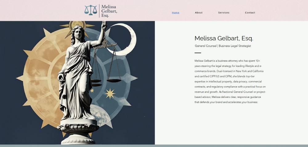
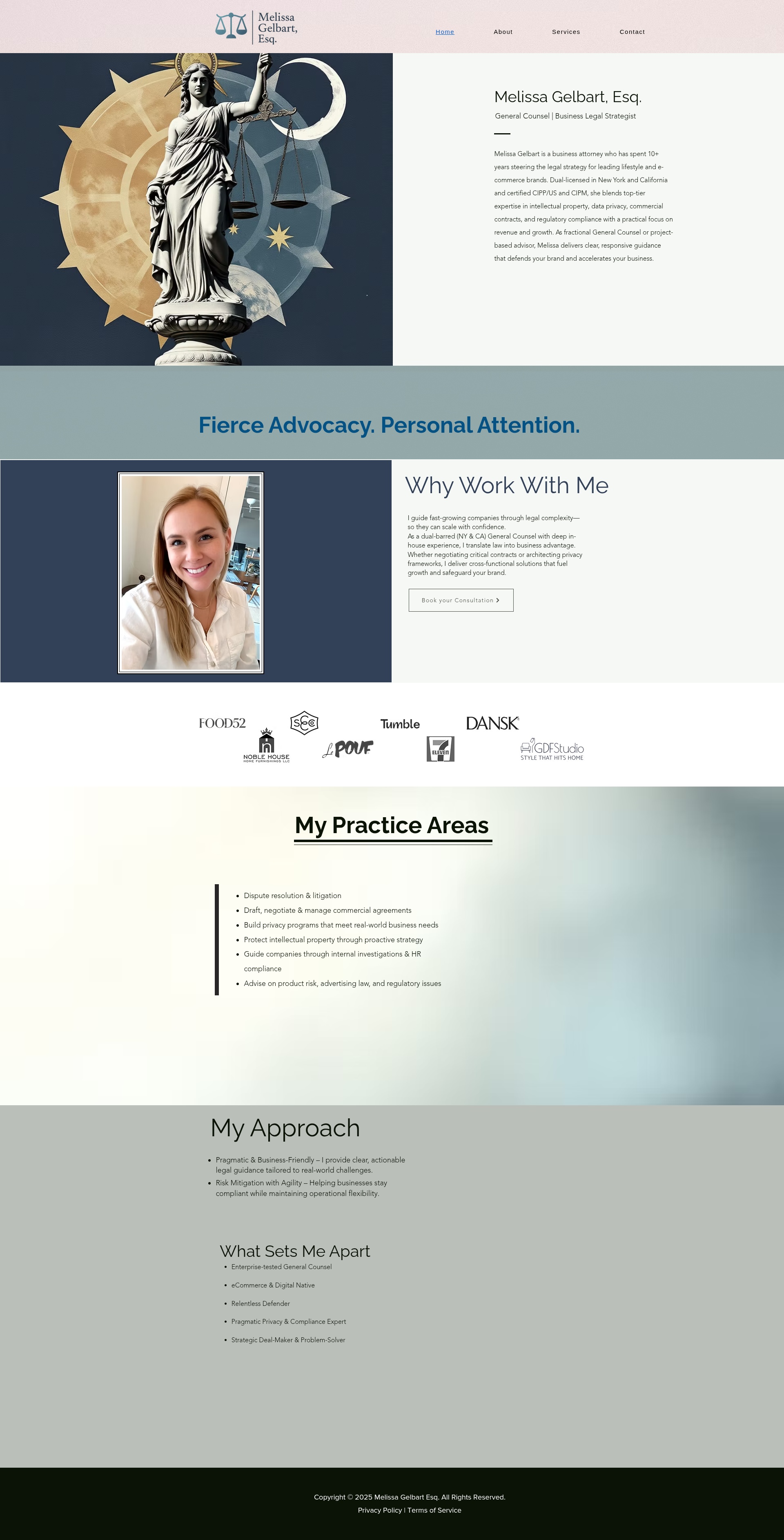
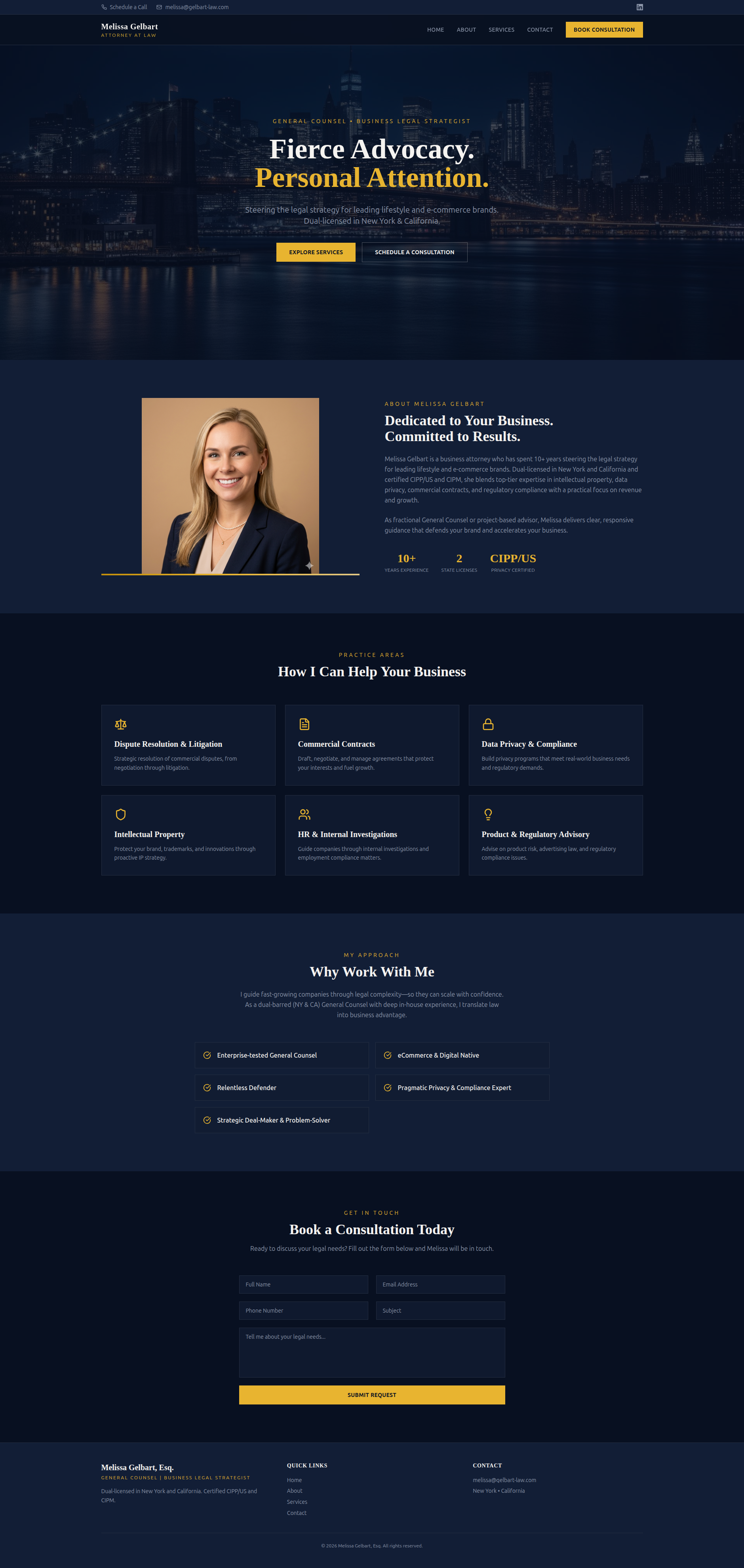
LexAtelier.com

WEBSITE REVIEWS & REDESIGN

MELISSA GELBART

A clearer, more modern approach for a business legal strategist’s website

We analyzed Melissa Gelbart’s website and redesigned key parts of the homepage to improve clarity, positioning, readability, and consultation-focused user flow.

BEFORE
AFTER

BEFORE

What wasn't working

  • Generic legal-style imagery that didn’t support her positioning
  • No strong headline above the fold
  • Important value points buried in small text
  • Tiny fonts that were difficult to quickly scan
  • Practice areas lacked visual hierarchy
  • E-commerce and lifestyle brand focus wasn’t clearly highlighted
  • Weak consultation-focused calls-to-action
  • Visitors had to work too hard to understand the offer
Homepage Mockup

OUR NEW CONCEPT DESIGN

What we improved

  • Clearer above-the-fold messaging
  • Stronger headline positioning
  • Better visual hierarchy and readability
  • More modern and polished homepage structure
  • Clearer positioning for lifestyle and e-commerce brands
  • Easier-to-scan practice areas
  • Stronger consultation-focused calls-to-action
  • Better use of credibility indicators
  • More approachable yet premium visual presentation
Before Homepage Mockup